Completed on: September 3rd, 2018
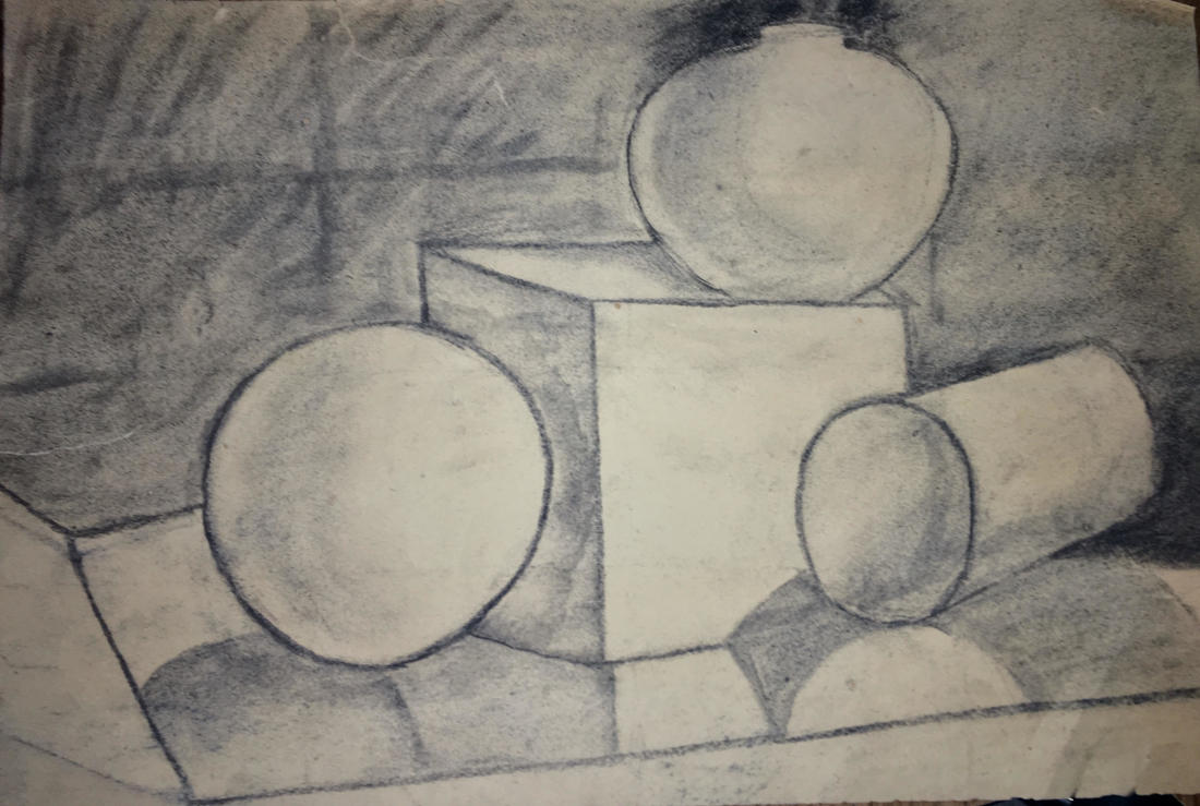
1. The techniques that I tried and mastered were shading, contrast, and shape. However, I struggled with texture and shadow.
2. I took inspiration from looking at Salvador Dali's work, as I had researched his style of surrealism, and thought his use of highlight and texture in his still life's made the painting look very realistic. I also drew inspiration from peers in my class, as well as Ms. O'Ryan, and they're use of shape and value.
3. My piece began by drawing the sphere, and then the box. I then took my time on shading the two, and redoing the lines on the shapes until I thought they looked more realistic than they had originally. From there, I drew the cylinder, then the vase, and went on to draw the box it is all sitting atop. The challenge was then creating the shadows, and making the image look at realistic as possible.
4. If I could do something over, I would make my shading lighter, and then add more color. I would do this because I think it would make it look more standout, and help to highlight the different compositional features.
Project 1: "Cup of Sunshine"
Completed: October 5th, 2018
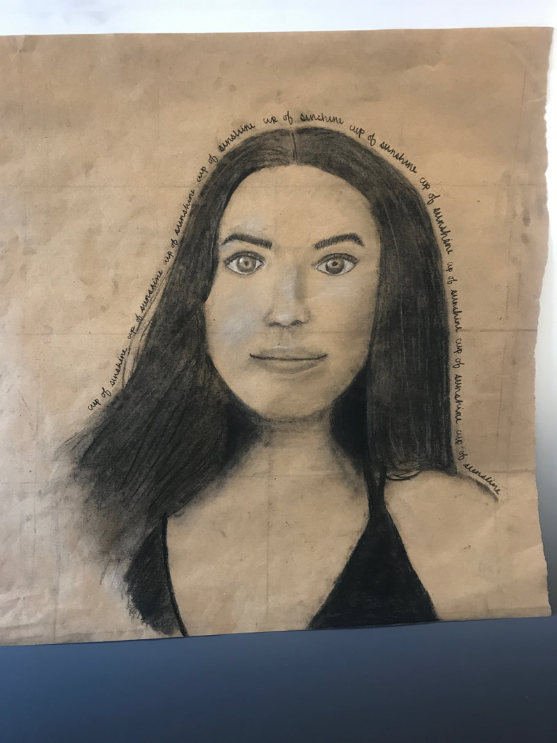
1. The techniques I used were shading, drawing what you see, and adding details such as whiteness in the eyes that makes a piece of art look for realistic.
2. I took inspiration from Ms. O'Ryan's self portrait and her ability to capture the details of facial expression meticulously, as well as drawing inspiration from my peers as we critiqued each other's portraits.
3. I began my piece by creating a grid proportionate to my photograph, and then stenciling the facial shape and hair shape. From there, I drew the eyes and eyebrows, following with the creation of the nose and the mouth. From there, I drew my shoulders, hair, and shirt. I then worked on fine tuning the drawing, with attention to detail, shading, and value. I finished by writing the words around my head.
4. If I could do this piece again, I would emphasize my eyelashes more, as well as use highlight more. I would also try to stick to the grid more, and make my hair more defined and accurate.
5. This piece relates to others in my collection, as it looks at the face we show society, and can be vital to comparing the persona that we illustrate to others, in comparison to that of our authentic self.
Completed: October 5th, 2018
1. The techniques I used were shading, drawing what you see, and adding details such as whiteness in the eyes that makes a piece of art look for realistic.
2. I took inspiration from Ms. O'Ryan's self portrait and her ability to capture the details of facial expression meticulously, as well as drawing inspiration from my peers as we critiqued each other's portraits.
3. I began my piece by creating a grid proportionate to my photograph, and then stenciling the facial shape and hair shape. From there, I drew the eyes and eyebrows, following with the creation of the nose and the mouth. From there, I drew my shoulders, hair, and shirt. I then worked on fine tuning the drawing, with attention to detail, shading, and value. I finished by writing the words around my head.
4. If I could do this piece again, I would emphasize my eyelashes more, as well as use highlight more. I would also try to stick to the grid more, and make my hair more defined and accurate.
5. This piece relates to others in my collection, as it looks at the face we show society, and can be vital to comparing the persona that we illustrate to others, in comparison to that of our authentic self.
Project 2: "Depth"
Completed on: October 31st, 2018
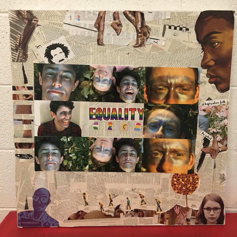
1. The techniques that I tried and mastered were photography with a 40mm lense. I also worked on mastering composition through placing images in effective places that emphasize and portray my message.
2. I took inspiration from Mikeila Borgia, fine art photographer, in their ability to paint faces with metallic colors that highlight definition of the facial features and the beauty in the abnormal. Their two specific pictures that I drew inspiration from are:
3. I began my piece but using modge podge to arrange newspaper strips as the background, and then cut different pieces of magazines that I found fitting to the piece. I started by adding the pieces on the bottom of the art: the woman's face, the characters climbing the hill, the tree of hands, and the blue tinted man. I then added the equality sign, the African American Woman in the right hand corner, and the Albert Einstein drawing. After that, I took photographs of two boys with face paint on, and put them around the equality sign. To finish my piece, I added the magazine paper's of the flowers and french words, the golden boots, the women's stomachs, and the legs in shade.
4. If I could do this piece again, I would make the photographs more focused on their faces without including the backgrounds, as well as planning it out more effectively to fully grasp where things would be, as well as leaving more of the newspaper section to be visible.
5. This piece relates to my other works in the idea of differences in everyone, portrayed in the different stomachs and the symbol of equality despite the lack of similarity between people. This reaches beyond equality in the face of individuality, and touches on the idea of what we portray to society in order to better fit in, and rather look deeper into the differentiation of everyone.
Completed on: October 31st, 2018
1. The techniques that I tried and mastered were photography with a 40mm lense. I also worked on mastering composition through placing images in effective places that emphasize and portray my message.
2. I took inspiration from Mikeila Borgia, fine art photographer, in their ability to paint faces with metallic colors that highlight definition of the facial features and the beauty in the abnormal. Their two specific pictures that I drew inspiration from are:
3. I began my piece but using modge podge to arrange newspaper strips as the background, and then cut different pieces of magazines that I found fitting to the piece. I started by adding the pieces on the bottom of the art: the woman's face, the characters climbing the hill, the tree of hands, and the blue tinted man. I then added the equality sign, the African American Woman in the right hand corner, and the Albert Einstein drawing. After that, I took photographs of two boys with face paint on, and put them around the equality sign. To finish my piece, I added the magazine paper's of the flowers and french words, the golden boots, the women's stomachs, and the legs in shade.
4. If I could do this piece again, I would make the photographs more focused on their faces without including the backgrounds, as well as planning it out more effectively to fully grasp where things would be, as well as leaving more of the newspaper section to be visible.
5. This piece relates to my other works in the idea of differences in everyone, portrayed in the different stomachs and the symbol of equality despite the lack of similarity between people. This reaches beyond equality in the face of individuality, and touches on the idea of what we portray to society in order to better fit in, and rather look deeper into the differentiation of everyone.
Project 3: "Walk A Miles"
Completed on: December 3rd
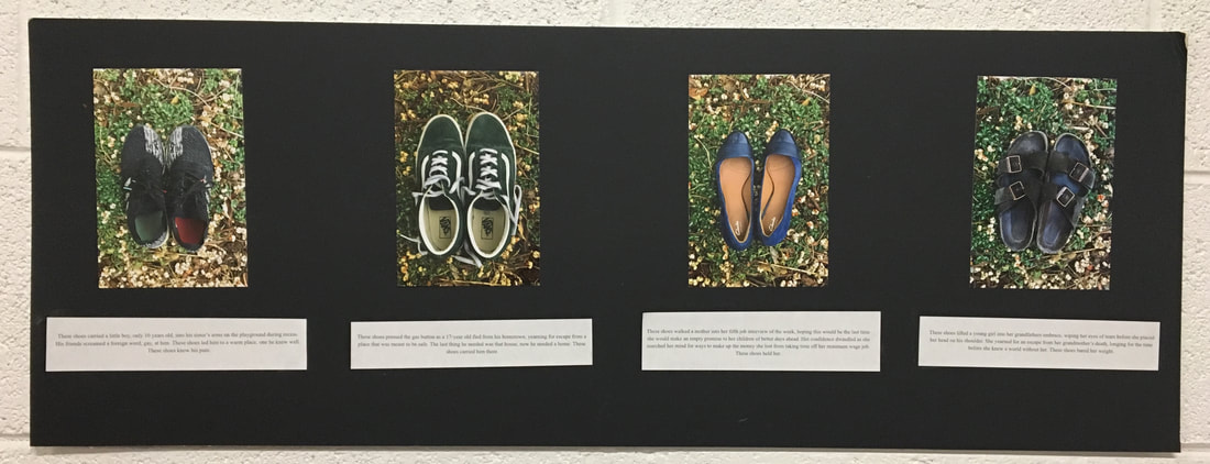
1. The techniques that I tried were photography and write word. I took photographs of the shoes using saturation and tone effects to edit them, and then write captions to explain their meaning.
2. I took inspiration from the "Humans of New York" project, in which a photographer photographed humans on the streets of New York, and used social media to tell their story. I thought it was interesting how the artist showed the difference between what people see at face value, and the real story that is behind people. In order to play off of this, I took inspiration from the quote "walk a ile in their shoes" as well, and used the photography and description of the adversity people faced in the shoes to highlight how everyone has obstacles that we cannot see.
3. My process started with the writing of the captions for the shoes, which I completed by interviewing people I know. I then photographed the shoes, and put it on a display.
4. If I could do this piece again, I would add more stories, as well as mix up the photography of the shoes, so that they are in the setting of where the adversity took place, or so that the background was conducive to the individual story.
5. I chose to create a piece that inspired people to look at the internal struggles people face. I photographed people’s shoes in order to show an object that seems harmless and without a story, but include a description of a hardship that was endured by the shoes. By doing this, I wanted to show the discrepancy between the face-value connotation of everyday things, and what they’ve symbolized as adversity for others.
Completed on: December 3rd
1. The techniques that I tried were photography and write word. I took photographs of the shoes using saturation and tone effects to edit them, and then write captions to explain their meaning.
2. I took inspiration from the "Humans of New York" project, in which a photographer photographed humans on the streets of New York, and used social media to tell their story. I thought it was interesting how the artist showed the difference between what people see at face value, and the real story that is behind people. In order to play off of this, I took inspiration from the quote "walk a ile in their shoes" as well, and used the photography and description of the adversity people faced in the shoes to highlight how everyone has obstacles that we cannot see.
3. My process started with the writing of the captions for the shoes, which I completed by interviewing people I know. I then photographed the shoes, and put it on a display.
4. If I could do this piece again, I would add more stories, as well as mix up the photography of the shoes, so that they are in the setting of where the adversity took place, or so that the background was conducive to the individual story.
5. I chose to create a piece that inspired people to look at the internal struggles people face. I photographed people’s shoes in order to show an object that seems harmless and without a story, but include a description of a hardship that was endured by the shoes. By doing this, I wanted to show the discrepancy between the face-value connotation of everyday things, and what they’ve symbolized as adversity for others.
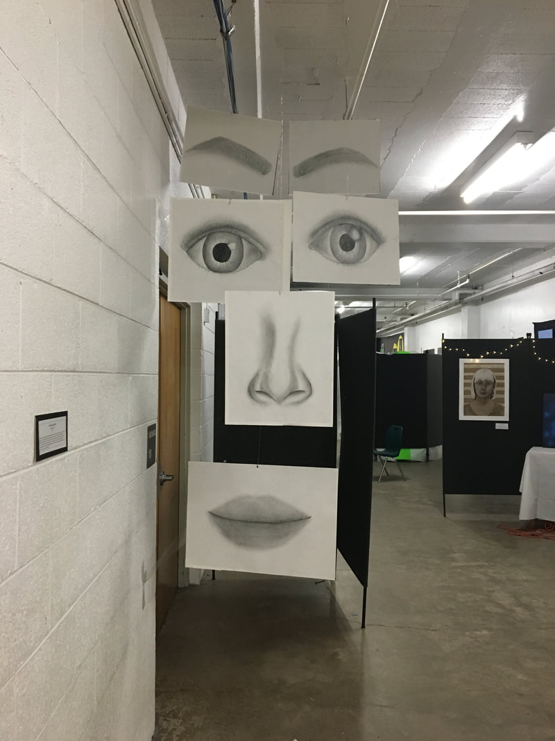
Project 4: "Disparate"
Completed on: December 14th
1. The techniques that I tried were shading with graphite, using the negative space to illustrate a realistic image, and drawing what I saw to help make my art look parallel to it's real life comparison.
2. I found inspiration in Vincent Van Gogh's facial features that are mixed up and arranged in a bizarre way. I really liked how he was able to convey totally different emotions from the same facial parts by rearranging their composition. I thought it would be interesting to go off of this style, and put together a face, but with the pieces separated.
3. My process started with the eyebrow, where I went off of videos to help me construct such a large piece. From there, I did the lips, making sure to blend and only use lines when there is an intersection of different body parts. Then, I did the nose, both eyes, and then the last eyebrow last. It was very difficult to make the eyebrow and the eyes look similar.
4. If I could do this piece again, I would probably use color, and make the features more proportionate to each other, especially the mouth and the nose. I will also be hanging this piece up, so it will not be flat nor connected, but rather scattered in a layered manner, so I would assure that the layers were the most effective.
5. This piece connects to other works in my collection, because from the first glance, the pieces are arranged in a hanging manner so that it looks like a complete face. However, once looked at from different angles, it is clear that the different facial parts are not connected, and have space in between. My goal was to convey the idea of what society sees, the put together face, in contrast with what is actually happening to the individual, which is a bunch of scattered pieces that look whole to the outside world.
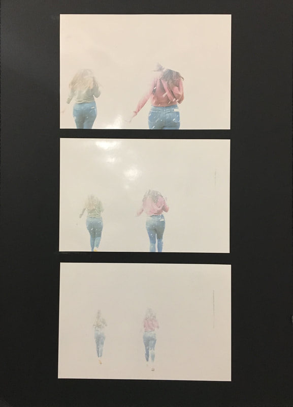
Project 5: "Gone Girls"
Completed On: February 23rd
1. The techniques I experimented with were using the portrait lens, instead of the standard photo lens. I also tried to create an element of motion in the photos, by having the models run in skewed patterns. Lastly, I also tried to separate the foreground and background by using solely white, in order to emphasize the girls running.
2. I found inspiration in the view I see when driving to the top of Loveland pass. On very cloudy or snowy days, before skiing, y dad will take me and my brother to the top of the pass to look at how the fog covers everything around us. I wanted to imitate the effect of seeing things vanish into what looks like blank space.
3. My process started by first, taking photos of the girls while they were still. This produced the same effect of seeing their bodies in stark contrast to the blankness of the snow, however I wanted there to be more movement. I then instructed them to run, and the sequence of photos is the visual of them running further and further from the camera.
4. If I were to do this piece again, I would take more bursts, or individual shots, of them running. That way, it could look almost like a stop-motion effect, and convey the idea of movement to a greater extent. I would also remove the umbrellas that they're holding, because you cannot tell that they have them, and it obstructs the view of their full body.
5. This piece relates to others in my collection, because it uses the same idea of running towards blank slate, and in that, creates the question of "are they running to or from". In this sense, I hoped people would draw this same wondering, and thus relates it to my other pieces by seeing them run away from what is known, and running towards a blank slate.
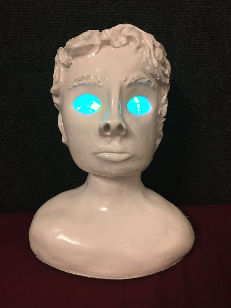
Project 6: "Windows of the Soul"
Completed On: February 23rd
1. With this being my "no experience needed" piece, I had no clue what techniques I should use, much less materials or how to even begin. At the end of the day however, I found that what helped me the most, was slipping and scoring, as well as using wooden knives to marge slabs together. It was also very helpful to use a sponge to smooth out the exterior of the bust.
2. I found inspiration in the saying "the eyes are the window to the soul", because I've always found it to be intriguing, and I wanted to ind a way to visually represent its meaning. I wanted to showcase the transition between viewing not only the exterior of people, but looking closer to what's inside, and I did that very literally with this piece.
3. I began my process by first, cutting and preparing slabs, and then using a cutout to form a base. From there, I added slabs to the base, shaping each one individually. I first shaped the shoulder, the neck, and then the chin. From there, I sculpted the nose and the mouth separately from the rest of the best, and then put them on using slipping and scoring. Once the face was built, I added hair, by adding snake-like pieces of clay, and attaching them to the head. Finally, I cut out the eyes, fired, and glazed the bust, and it was finished.
4. If I were to do this piece again, I would make the nose less up-turned, and I would stop it from leaning back as much. I would also probably paint it a different color, one that looks like old metal, so that it would look completely covered.
5. This piece relates to others in my collection because of its contrast to the facade that we put up for society vs the beauty in our genuine self. The reason I chose to color it white, was to comment on the boring face that we put on for others to see, trying to fit in the best that we can. However, by cutting out the eyes, my goal is to highlight the beauty and color in the side of ourselves that we close off to others, which is the aim of the other pieces in my collection too.
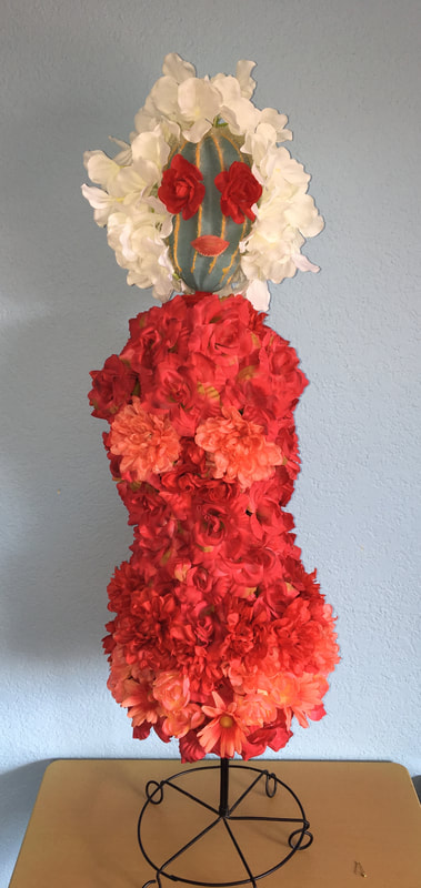
Project 7: "Woman in Bloom"
Completed On: March 29th
1. The techniques I used were hot glue, wire creation, and layering. I used the glue gun to add all of the flowers and facial features to the cactus, and I used the wire to hold the head onto the frame. Layering was where the real challenge came in, as it was difficult to layer the flowers in a way that looked both elegant and still highlighted the beauty in each flower.
2. I was inspired by Christian Dior Couture’s Atelier de Fleurs Lemarie in Paris, which is a line inspired by flowers and feathers, and in specific, his mini–sized 1949 Miss Dior couture gown. I loved the way that he incorporated flowers into fashion, striking the balance between nature and industry. The one thing I wanted to alter in my work, was the have my piece more form fitting and curvy, instead of his flowy and elegant work.
3. The process that I used for this piece, was first, I found a model of a fashion-type wire mold at a shrift store. It was made with black wires that intertwined to create a body shape, and after that, I purchased an assortment of fake flowers. From there, I hot glued my first layer of flowers onto the mold, but I soon realized that the flowers caused the silhouette to lose it's shape. Instead, I got more flowers, added them to the hips, the bottom of the dress, and the chest, which emphasized the cures and shape of the figure. However, I was not pleased with simply a dress, so I added the cactus as a head, and the flowers as the facial features onto it, which helped my piece develop more meaning.
4. If I were to do this piece again, I would like to find a better material for the lips, and add some more of the white leaves for the hair. I would also find a more proportional head to the body, because the current head is a bit small.
5. This piece relates to others in my collection because it contrasts the cactus head to the beautiful blooming flowers, representing the rough mental health in contrast to the beauty that we show the world. I also wanted the flowers to portray the blooming person, in a sense how humans are growing, which is similar to the message in my other pieces.
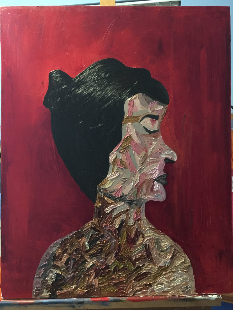
Project 8: "Your Mother's Keeper"
Completed On: March 30th
1. The techniques I used in this piece were only painted with a pallet brush, excluding the red background, as well as using individual strokes to convey a skin tone, despite not being blended. Doing individual strokes with a pallet brush was extremely challenging, and it required me to do multiple strokes, wait till they dried, and then came back to continue layering the strokes. It was also very difficult to get precise edges with the pallet brush, but after multiple tries, I got it.
2. I was inspired by the work of Elena Gual, specifically her painting, Trinidad. She does work with individual paint strokes, but instead of blending each stroke, she just overlaps the large strokes. While her colors were more alike to the skin tone, and she more precisely captures the shadows, I took a bit of a turn with the colors, and mine were more random and not always the actual color of the skin.
3. The process for my piece was to first, outline the silhouette on the canvas, and then paint the red background around it. after that, I began to do the shoulder/chest area with my pallet brush, painting about 30 strokes, letting it dry, and then coming back and completing the same process. From there, I did the hair, adding brown streaks to add depth, and then began to do the nose, lips, and eyes, which were the most difficult part. Due to the largeness and lack of flexibility of the pallet brush, it was very challenging to capture the specific details of the facial features, but after a few attempts, I was able to come to a product I liked. Finally, I added the color to the face, and then outlined the face one more time in red.
4. If I were to do this piece again, I would try to do better shading by keeping the dark colors on the left side, and gradually moving to brighter colors as I move left. I would also add more detail to the hair, especially the bun, and make the lips and the nose closer on the silhouette.
5. This relates to other pieces in my collection because it highlights the broken up, multi-colored aspects of the skin, speaking to the imperfections and messiness of real life, despite the strong face that we put on for others. My other pieces try to capture the discrepancy between our genuine selves, and the version of ourselves that we show society, which is seen in this piece through the lackluster of colors, and the lack of definition in the woman.
